So we were talking in class about adding personality to your drawings. You don't want them all facing forward with their arms out, do you? No, silly. Sometimes you want your illustrations to be sassy, or romantic, or fierce. It just depends on the mood of your garment, and how you want your customer to feel in it.
| This figure is static and boring |
| Versus these figures which have movement and attitude |
| 3 quarter-turned head |
 |
| Front facing head |
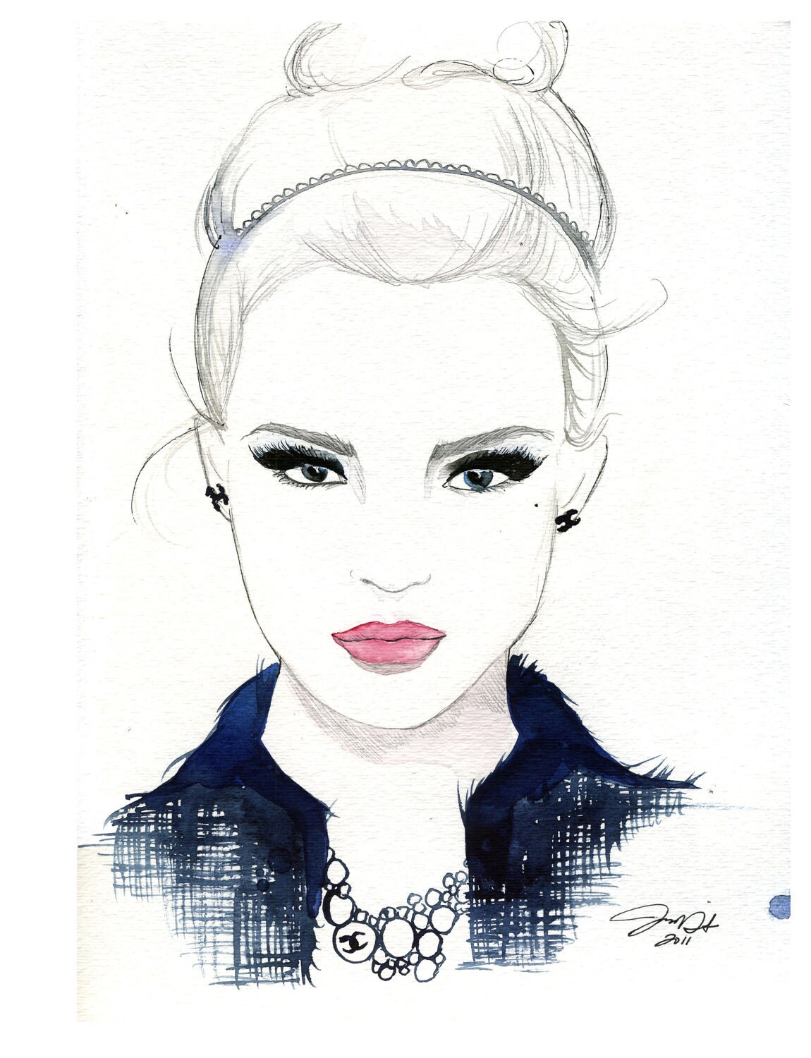
Same concept, the 3 quarter-turned head is more interesting to look at than the frontal face (although both of these are beautiful).
How to draw what I am talking about: When sketching, like in one of my previous blog posts, you start with your center front or balance line. When turning the body, move the center front line. The key to getting movement is to angle the lines of your hips, bust, waist and shoulders. The girl in the gray dress, her shoulders and bust are tilting down on the right side, while her waist and hips are tilting up on the right side, giving the body movement. When this happens, one side typically "crunches" in, ie her right side (as i am looking at the image). The girl on the right is a little hard to see, but it looks like her shoulders, bust, waist and hips are all angled down to the left slightly- because she's almost completely turned sideways. Her center front line follows the curve of her torso, and starts at the base of her neck; so it will be curved like a big C from her neck to her pelvis, and that ensures that her body stays balanced.
Leg positioning can also give you personality. By crossing them, keeping one bent, sticking one out, or anything within the realm of human flexibility, you can add a completely different dynamic to your look. I think this picture below is really awesome, and it is a good representation of leg positioning.

No comments:
Post a Comment